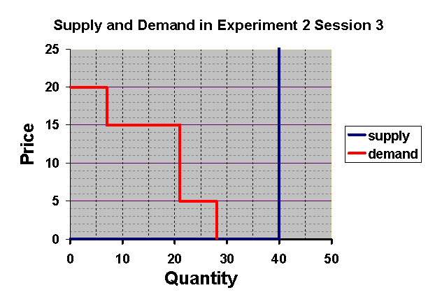
Figure 2.1
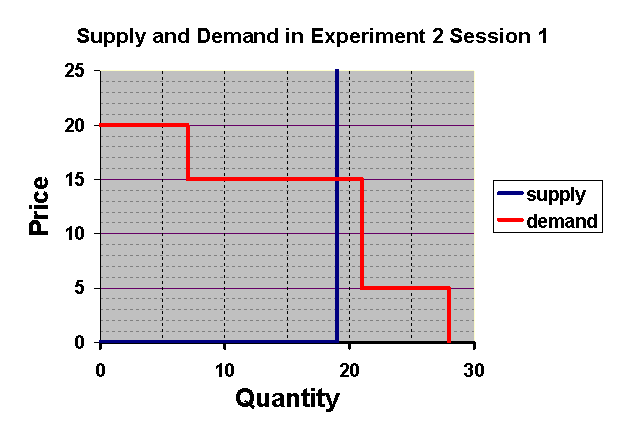
Figure 2.1
It is interesting to see that in this session, prices
are significantly different from the competitive equilibrium prices.
Figure 2.2 shows the distribution of classroom average prices in the
first round of Session 1 and Figure 2.3 shows this distribution
for the second round of Session 1. Figures 2.2 and 2.3 show the distribution
of average prices observed in each of the classes in Rounds
1 and 2. Average prices in Round 1 are seen to be well below
the competitive equilibrium price of $15. In round 2, these
prices have risen slightly, but are still far from the competitive equilibrium
prices. We suspect that the reason for such slow movement toward
equilibrium can be seen by examining the supply and demand curves
in Figure 2.1. Notice that the vertical segment of the supply curve
and the vertical segment of the demand curve are quite close together over
the range of prices from $5 to $15. This means that at any price
between $5 and $15 there is little pressure for prices to change.
For example in the situation shown in Figure 2.1, if just two of the 21
buyers persistently misunderstand their profit incentives or for
some other reason fail to compete vigorously to obtain a fish, the
market could settle on any price between $5 and $15 with no pressure for
change.
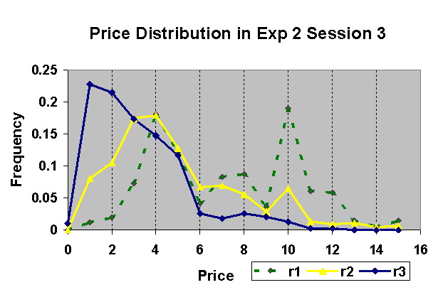
Figure 2.4 reports the complete distribution of all transaction prices in all sections. The purple line shows the histogram of prices in Round 1 and the yellow line shows these prices for Round 2. From this figure it is evident that there is some tendency for prices to rise toward the competitive equilibrium price in Round 2, but the movement is slow. It would have been interesting to see a third round.
Figure 2.2
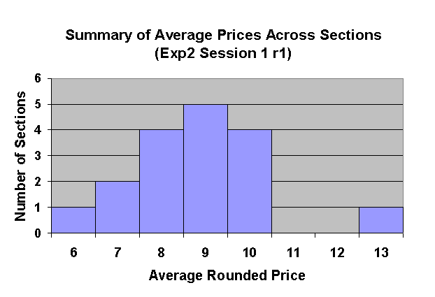
Figure 2.3
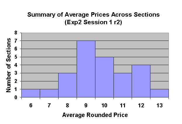
Figure 2.4
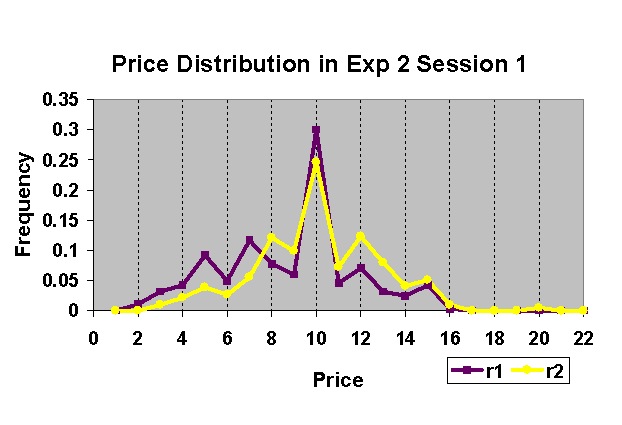
Figure 2.5
In the first round of this session, most classes had average prices
closer to $9 than to the equilibrium value of $5. In the second round,
outcomes became more rather than less disperse across classes, though in
many classes the price fell closer to the competitive equilibrium value.
We believe that the dispersion across classrooms is the result of a design
defect in the experiment. For some class sizes, the demand
curve and supply curve would have been very close to each other over the
vertical range from $5 to $15 and for other class sizes they would have
been further apart. Thus there would have been considerable variation
in the amount of market pressure to move the price toward equilibrium.
Figure 2.6
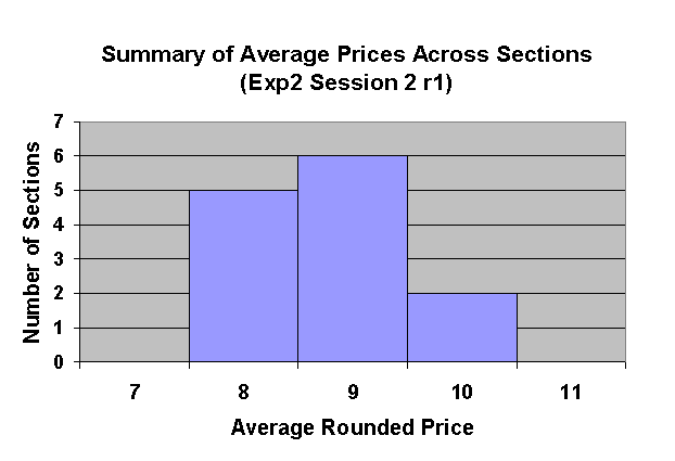
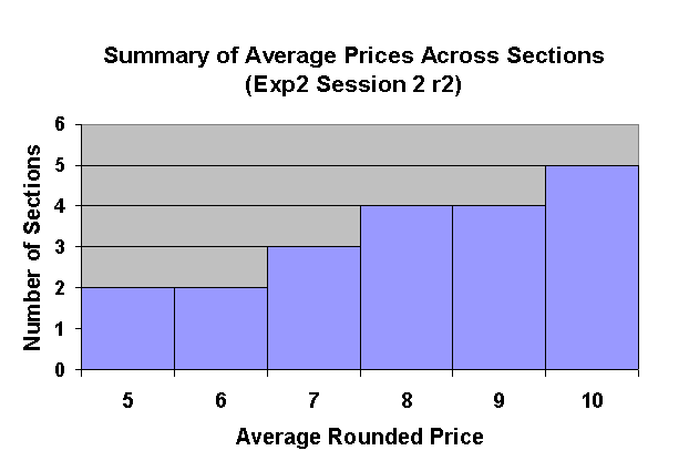
Figure 2.8 shows the histograms for all prices in Rounds 1 and 2 of Session 2. It appears that there is some downward movement in these price toward equilibrium, but this movement is very slow.
Figure 2.8
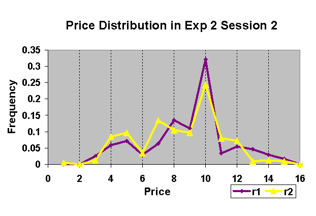
Figure 2.9
Figures 2.10, 2.11, and 2.12 show that the average price in classrooms tends to fall in each of the three rounds of this session. By the third round, 10 of the 19 classes for which we have observations had average prices well below $5 and so fishermen are in fact losing money.
Figure 2.10
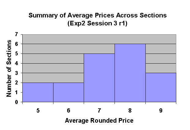
Figure 2.11
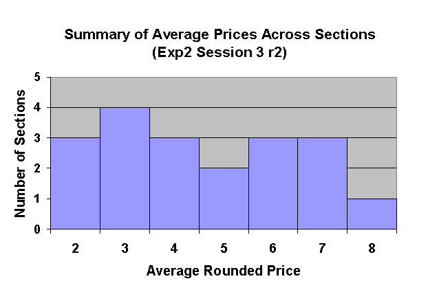
Figure 2.12
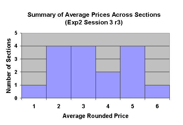
Figure 2.13
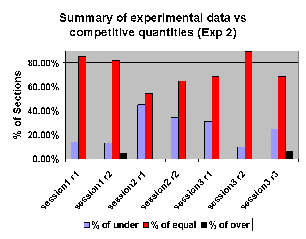
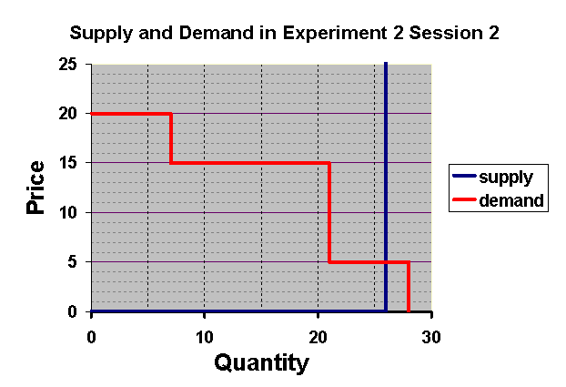
The remarkable thing about these results is the frequency with which there were fewer sales than the equilibrium number, especially in Session 2. This can happen only if at the end of trading there is some fisherman and some demander who could make mutual gains by making a trade. In Session 2, some of the fishermen had 2 fish to sell, while in Session 1, they each had only 1. For some reason, it appears that many fishermen didn't sell their second fish. This helps to explain why the price was not forced down all the way to competitive equilibrium. But why didn't they sell their second fish. Can there be this many people who simply didn't understand the rules? Another possibility is that there was some collusion among fishermen not to drive the price down by selling all of their fish.
Figure 2.14